What we cover in this article
Unlock the power of data with our guide to building dashboards. Learn step-by-step how to create custom dashboards in Excel, focusing on clear visualizations and real-time updates. For a streamlined, comprehensive solution, Minimal Dashboard offers customizable, real-time integrations, enhancing decision-making without the hassle. Start optimizing today!
Contents
- Introduction
- Wondering How to Build a Dashboard That Works for You?
- Why Listen to Us?
- What Is a Dashboard?
- Why Build a Custom Dashboard?
- How to Build a Dashboard in Excel in 7 Steps
- Best Practices for Building a Dashboard
- Take Control of Your Data with Minimal Dashboard
Introduction
Building a dashboard helps monitor business performance, track KPIs, and make data-driven decisions efficiently. This guide outlines steps to create a custom dashboard in Excel and covers best practices for clear visualizations, real-time updates, and streamlined insights. For businesses seeking a comprehensive, real-time solution, Minimal Dashboard offers powerful, customizable dashboards with seamless integration across essential tools.
Wondering How to Build a Dashboard That Works for You?
Dashboards are essential for monitoring business performance, tracking KPIs, and making informed decisions.
Whether you’re selling digital products or monitoring team workflows, a solid dashboard is key. But does creating one seem overwhelming? It doesn’t have to be.
In this article, we’ll show you how to build a dashboard step-by-step, highlight essential tools, and give you tips on making the most out of your data.
But first…
Why Listen to Us?
At Minimal Dashboard, we specialize in helping businesses simplify their data tracking with customizable, real-time dashboards. Our platform integrates seamlessly with tools like Stripe and Fathom Analytics, ensuring you have everything in one place. By trusting us, you get an intuitive dashboard that helps you make smarter decisions—without the hassle of switching between tabs.
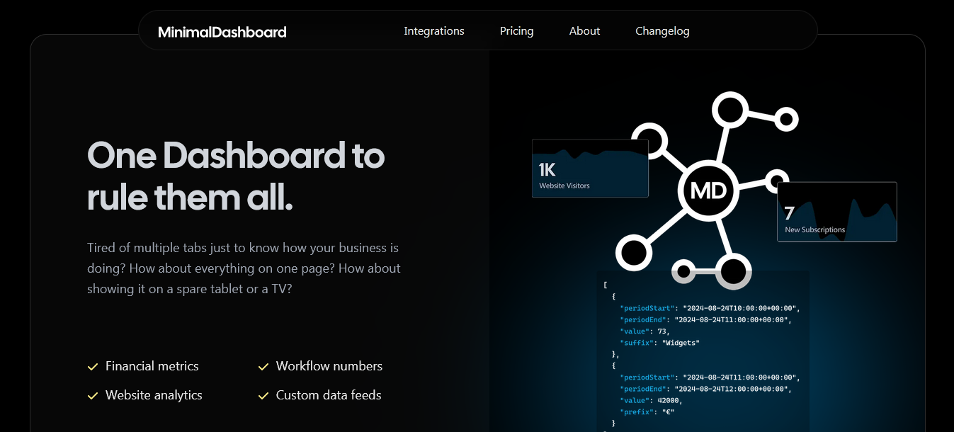
What Is a Dashboard?
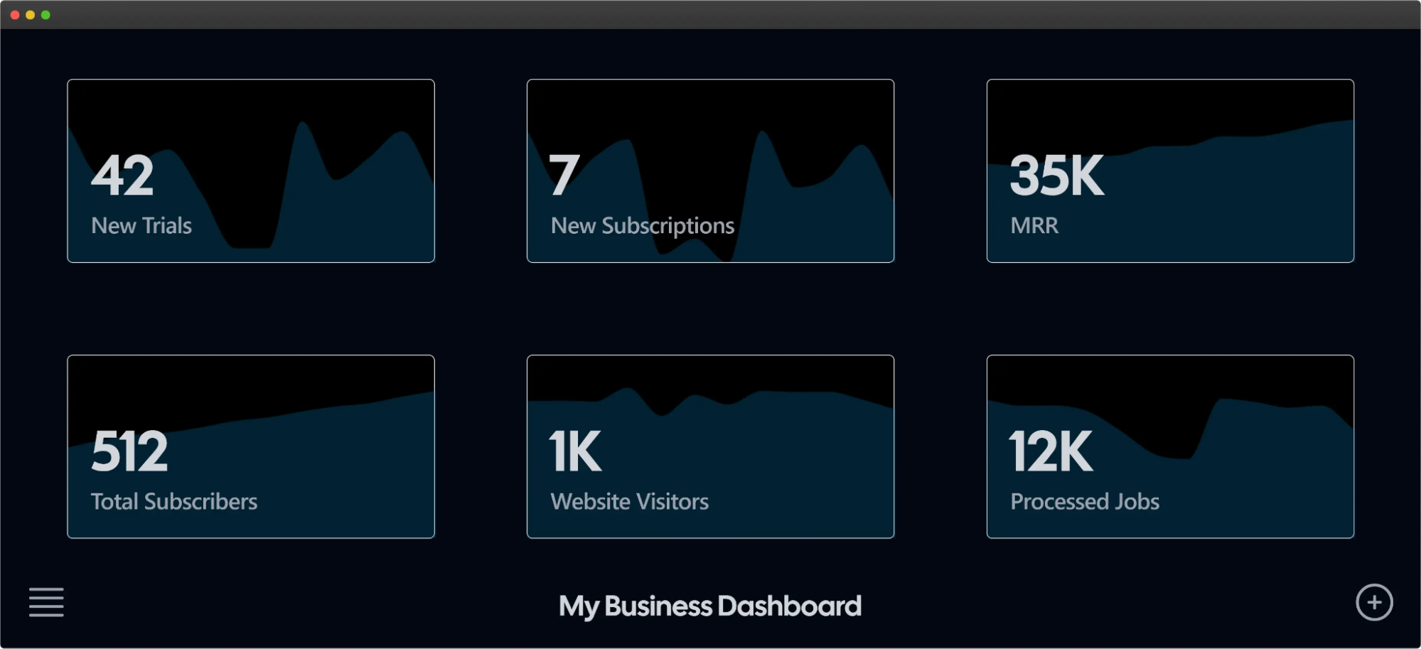
A dashboard is a visual tool that displays key data in one place, helping businesses track performance and make informed decisions. It consolidates various metrics, such as sales, user activity, or workflow stats, into a single, easy-to-read view.
For example, a subscription dashboard might display metrics like:
- New subscriptions
- Monthly recurring revenue (MRR)
- New trials, total subscriptions
- Website visits
This allows teams to quickly assess key performance indicators and make informed decisions to drive growth or address potential issues.
Why Build a Custom Dashboard?
Building a custom dashboard allows you to tailor data insights to fit your specific business needs. Instead of sifting through irrelevant metrics, you can focus on what truly matters.
- Tailored Insights: Custom dashboards let you zero in on the metrics that matter most, filtering out irrelevant data. With Minimal Dashboard, you can customize your view to display only the KPIs that drive your business success, helping you stay focused on what truly impacts your growth.
- Efficient Monitoring: By consolidating key metrics in one place, you can easily track sales, customer activity, and product performance without feeling overwhelmed.
- Streamlined Decision-Making: Access to real-time, relevant data enables quicker responses to trends and issues, enhancing your ability to make informed decisions.
- Improved Productivity: A personalized dashboard helps teams stay organized and focused, leading to better performance and faster execution of tasks.
- Enhanced Collaboration: Custom dashboards can be shared across teams, ensuring everyone has access to the same critical information, fostering alignment and teamwork.
This personalized view makes monitoring more efficient and less overwhelming. Ultimately, a custom dashboard empowers you to optimize operations and drive better results.
How to Build a Dashboard in Excel in 7 Steps
Here’s a practical, step-by-step guide to building a dashboard in Excel.
1. Step 1: Import Your Data into Excel
To build a dashboard, you need data to work with. If your data is already in Excel, you’re ready to move on. Otherwise, you’ll need to import it. Excel offers various ways to bring in data:
- Copy-paste from another file
- API integrations (like Supermetrics or Open Database Connectivity)
- Power Query, an Excel add-in, to pull from databases
Once imported, confirm the data is formatted correctly for your needs. For simplicity, keep data fields consistent and remove any unnecessary information to streamline your dashboard.
2. Step 2: Set Up Your Workbook Structure
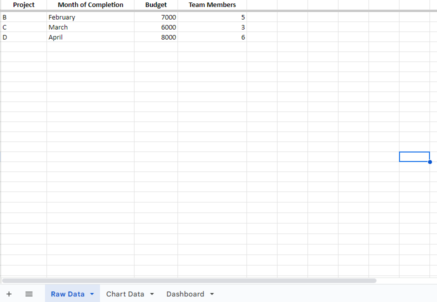
Organize your Excel workbook by creating and naming separate worksheets:
- Raw Data – Stores unprocessed data.
- Chart Data – Holds data to visualize.
- Dashboard – The main sheet for building the dashboard.
This setup keeps data organized and simplifies creating and adjusting the dashboard.
3. Step 3: Convert Raw Data to an Excel Table
Convert your “Raw Data” into an Excel table to manage data more efficiently:
- Select your data range, then go to Insert > Table.
- This format enables using Excel’s filtering and sorting tools.
- Review for typos or inconsistencies, as errors can impact later calculations and visualizations.
4. Step 4: Analyze and Organize Key Data for the Dashboard
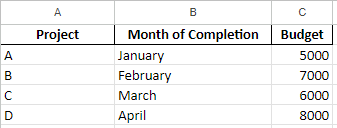
Determine which metrics you need on your dashboard. This step helps to focus on key data points for your goals. Move these metrics to the “Chart Data” tab:
For a project budget dashboard, you might transfer columns like Project Name, Month, and Budget.
Select the best Excel tools based on your needs:
- Charts for visualizations
- Formulas for calculations
- Conditional formatting to emphasize key data
- Pivot Tables for summaries
- Power Pivot for handling large datasets
5. Step 5: Decide on Visual Elements
The dashboard’s value lies in its visuals. Select chart types that effectively convey your data’s message:
- Bar charts for comparative data
- Pie charts for proportions
- Gantt charts for timelines
- Dynamic charts for real-time updates
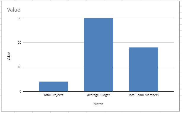
In this guide, we’ll use a clustered column chart to compare budgets across projects.

6. Step 6: Build Your Excel Dashboard
With data and visuals decided, it’s time to build:
- Go to your “Dashboard” tab and click Insert > Column > Clustered Column Chart.
- Right-click the blank chart box and choose Select Data.
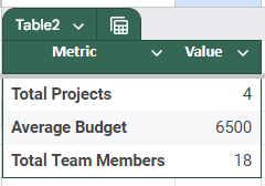
- Select your data range (excluding headers) from the “Chart Data” sheet, then hit Enter to populate the chart.
- Adjust labels and layout by right-clicking the chart and selecting Select Data again to edit the X-axis.
7. Step 7: Customize the Dashboard for Usability
Personalize the dashboard to enhance usability:
- Add drop-downs for filtering data.
- Use slicers with Pivot Tables to control data views.
- Create dynamic charts to auto-update visuals with new data.
- Customize fonts, colors, and layouts to match your brand or personal preference.
These finishing touches make the dashboard more interactive, informative, and user-friendly.
8. Why Minimal Dashboard Could Be a Better Option
Building a dashboard in Excel is a great way to get started with data visualization, but Minimal Dashboard offers several advantages for those who want a more streamlined solution:
- Time Efficiency: Minimal Dashboard consolidates key business metrics from various sources in one place, reducing the time spent on data preparation.
- Real-Time Monitoring: It provides real-time updates across devices (tablets, TVs), ideal for teams needing instant insights.
- Integration and Customization: Minimal Dashboard supports popular tools like Stripe, Fathom Analytics, Helpscout, and Klaviyo for easy data aggregation without manual input.
- Ease of Use: With a 30-day free trial, Minimal Dashboard lets users explore its features without setup complexities, unlike manual Excel dashboards that require more initial configuration.
Using Minimal Dashboard may be the preferred choice for businesses looking to monitor metrics more efficiently without the manual steps and maintenance Excel dashboards require.
Best Practices for Building a Dashboard
1. Keep It Simple
Avoid clutter by displaying only essential metrics. Too much information can overwhelm users and obscure important insights. Focus on clarity and simplicity to enhance user experience. A clean design will help users quickly identify the most critical information they need.
2. Use Clear Visualizations
Choose appropriate charts and graphs for data representation. Different types of data are best represented in specific ways, so understand your data before selecting a visualization. Ensure that visualizations are easy to read and interpret, using contrasting colors and labels for clarity. This will enable users to grasp insights at a glance.
3. Prioritize Key Metrics
Highlight the most critical metrics at the top or center of the dashboard. This placement makes it easier for users to focus on what matters most, facilitating quicker decision-making. Consider using larger fonts or bolder colors for these key metrics to draw attention effectively.
With Minimal Dashboard, you can centralize your key metrics in one platform, enabling immediate insights that support proactive decision-making and strategy optimization.
4. Ensure Real-Time Data Updates
Set up automatic data refreshes to provide the most current information. Outdated data can lead to poor decision-making, so ensure your dashboard reflects real-time metrics. This helps teams make informed decisions based on the latest insights and enables proactive responses to changes.
5. Be Consistent
Use consistent color schemes, fonts, and layouts throughout the dashboard. Consistency fosters familiarity and helps users navigate the dashboard more intuitively. Stick to a limited color palette to avoid confusion, and use the same styles for similar types of data.
6. Educate Users
Provide resources or training sessions to help users understand how to use the dashboard effectively. This can include guides, video tutorials, or live training sessions. Ensure they know how to interpret the metrics and leverage the dashboard for data-driven decisions. Empowering users with knowledge will enhance their confidence and proficiency.
7. Regularly Review and Update
Schedule periodic reviews to assess the dashboard’s effectiveness. As business needs evolve or new data sources become available, updating metrics and visuals is essential. Continuous improvement will keep the dashboard relevant and useful, adapting it to the changing landscape of your business.
Take Control of Your Data with Minimal Dashboard
Nowadays, businesses need to keep an eye on their metrics as they happen. Minimal Dashboard empowers you to visualize data, identify trends, and make informed decisions quickly. Our user-friendly platform caters to individual founders, small teams, and large organizations alike.
With customizable dashboards and seamless integrations, Minimal Dashboard simplifies data management without the overwhelm. Whether tracking key performance indicators or daily metrics, you can trust us to deliver the insights you need.
Ready to elevate your data management? Start your free trial with Minimal Dashboard today!
